For our first brief of the course, we are exploring the concept of a quadriptych, which is a polyptych of four images.
‘Polyptychs have traditionally been used to depict sacred scenes and commonly appear in places of worship such as churches.’
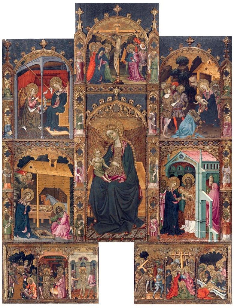
I find polyptychs quite fascinating, for I see them as a sequential narrative to tell stories in a visually engaging way, especially during the earlier times, where people may not have access to books and/or education, polyptychs are a great form of explaining a narrative of sorts.
I’ve always loved churches and have been fascinated in the way the interiors are structured and decorated with angelic figures ever since I was a child when I used to go with my family. Though I do not go anymore, I could never forget the peacefulness it brought to me and the memories I had when I used to go, and I love its connotations with traditional polyptychs as well, therefore this is something I’d like to explore and expand upon on my project. My first crit inspired some ideas for me to explore this, as well as combining my memories with what inspires me. I hope to answer the four big questions (WHO, WHAT, WHERE, WHY) with the ideas that are born from my research and inspiration.
Week 1 Case Studies: Who, What Where and Why?
One thing I found really interesting in the video case studies of practitioners we have been given, they all spoke about convincing people to use their design and agreeing with it, rather than the actual work itself. I think what I really admire is that, they are all confident in their work and its purpose, how it can applied to the brief or its intention of use, and it makes me happy that they are confident with their work because they understand it, rather than being depreciative about it. It made me consider how I should carry my work, will it deliver the answers to the question and would I be happy with it rather than just being simply satisfied. In particular, I was quite interested in Paula Scher and Michael Wolff’s work.

“How each type can carry colour”
“Emotion through design” – Michael Wolf


“Make type talk more than words” – Paula Scher”
What I found from both artists is they design something with the prospect that it can adapt to its time or even multiple eras, a flexible work that can be considered timeless, and I believe that is what makes an iconic logo/brand identity. Though I’m not designing a logo, I do like the idea of it being viewed in multiple periods and people would still connect to it emotionally.
Research: Arch Interiors
After my crit and taking some time annotate the brief and come up with a few concepts to consider.
I began to explore churches and scared spaces in South East Asia, as someone from the Philippines, I wanted to explore our culture and what is quite cool about South East Asia, it is more communal and a lot of our cultures despite being different countries do cross over a lot.

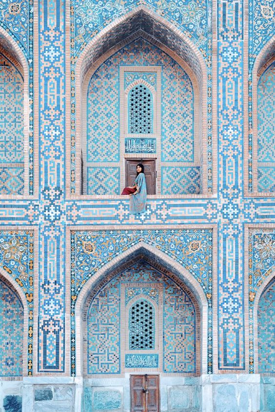
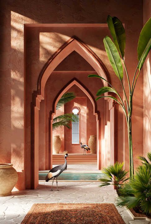
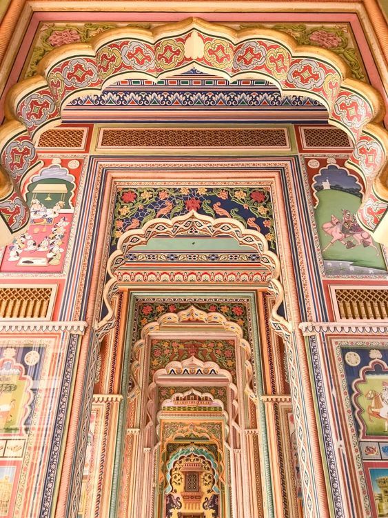
I love that they’re all so diverse and come in all manners of shapes and sizes, additionally they are not restricted by colour palettes, such as the blue temple in Uzbekistan. This is something I’d like to incorporate to my quadriptych, as I myself as a n individual and a designer, I am not afraid of colour, in fact, I enjoy it! I love to play with different types of colour palette and seeing what works with what, or what shade evokes certain emotion (i.e. yellow and orange for happiness) but paired with another colour it could have a whole new meaning altogether.

Leave a comment