For weeks 5 to 8, I did them back to back as unfortunately we don’t have a reliable internet source at this time, and it was getting difficult to keep up with uni work as I had to rely on public spaces and sometimes my workplace office to gain access to this! I began to write in my journal what I want to say on my blog, and when I finally get reliable internet, I’d type it all up in one big chunky post. Sometimes life happens, but I try not to let that get to me and there’s always a way to get round things if you give it a go.
Week 5 introduces the second brief, ‘Process’, in which we explore processes and how we use this to produce works within our practice. As with any creative brief, I like to print it out and annotate it physically to get a good sense of what I could do for this brief and how to tackle the problem and come up with a solution.
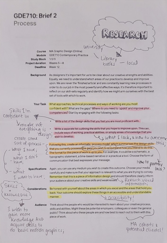
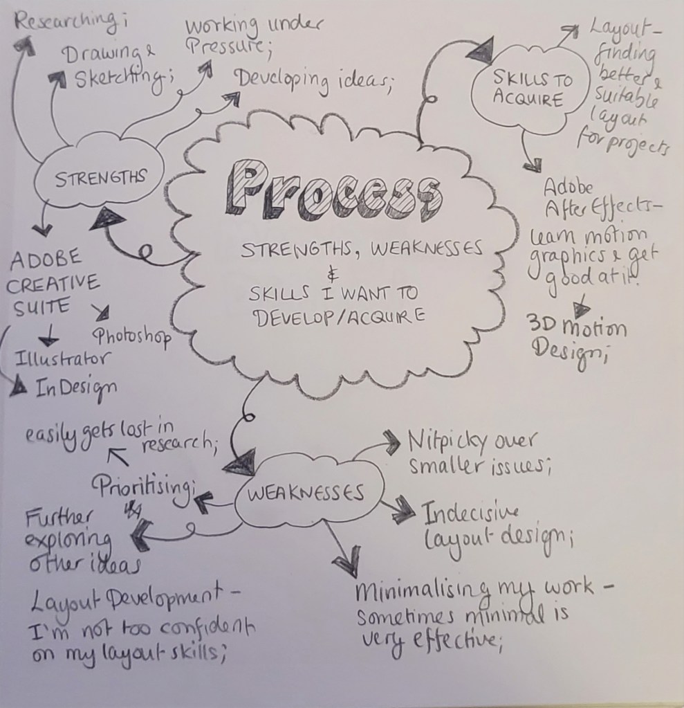
I then proceeded to write a list of strengths and weaknesses and how I could highlight them in a way, or how could I potentially bridge that gap to make myself a better designer and person in general.
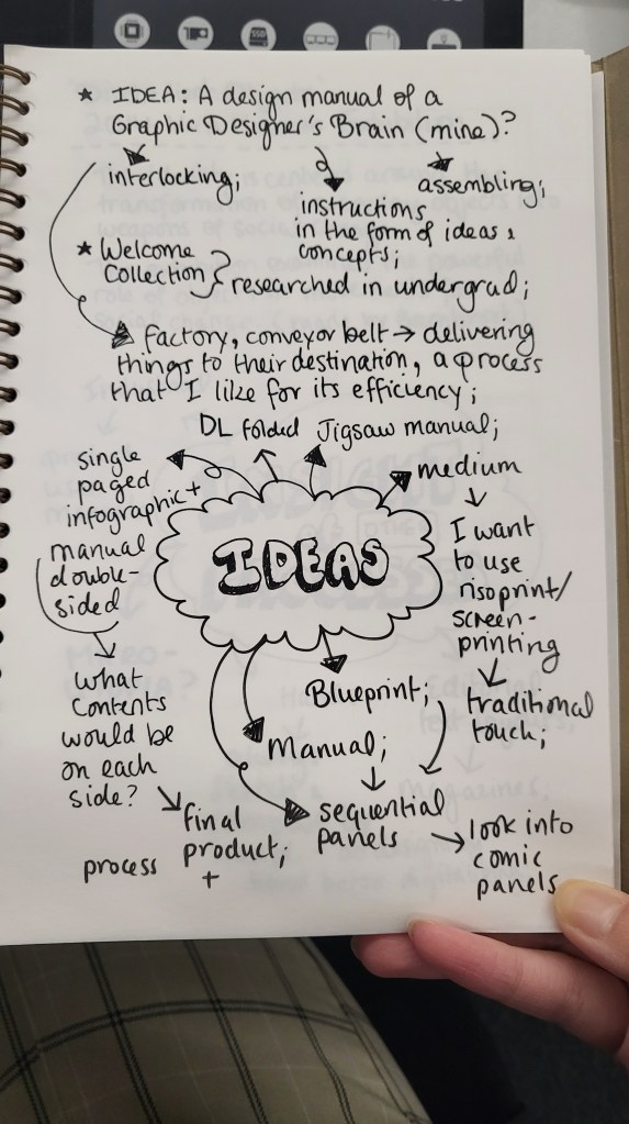
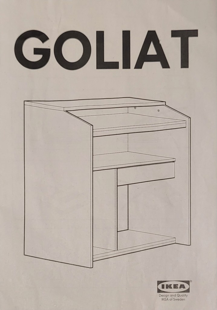
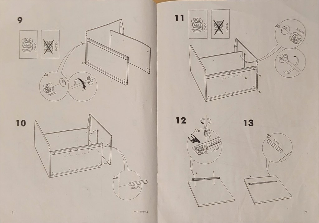
I was initially inspired to go for a manual or how-to-guide of sorts after being influenced by an IKEA manual. We had been building a desk at the time, and I had left the manual on the coffee table while working on my annotations, and it sparked an idea in my mind!
Furthermore, I went on to create a mood board on Pinterest of visual inspiration and research I can use to produce my work, and I found many interesting images to work with.

I really like the idea of using a different material or working with a more restricted colour palette. I immediately thought of riso print, which was a print practice I had experienced in my undergrad and school. Though I probably won’t have it printed professionally with a proper risography company, I want to recreate the feeling and image it has, so I had done some research for companies throughout the UK and found Dopple Press.
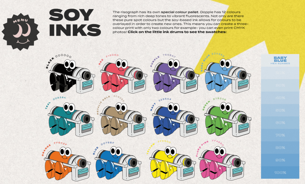
I really like colour contrasts especially those that compliment each other, so though it was hard choice to make as Dopple has an array of wonderful palettes, I did end up choosing the Lobster Red and Duck Teal for my work.
I continued to attend the peer-to-peer sessions Alan and Kristian had initiated outside of the lectures, as I found myself being able to attend them more than the usual webinars at the time. It was very helpful and it was good to collaborate with people on the same boat as you and could be honest with you regarding your work – I was always scared about presenting my unfinished or in-progress work with other people, but attending the sessions when I can and my tutorials with Paul helped me out a lot. I think its very easy to get stuck in a pothole and worry yourself to nothing when you haven’t tried it yet. This is something I’m still working on, but I like to think I’m improving with this course as well as my full-time job.
They gave me good feedback, especially Lucy, on my sketches which I’ll show below.
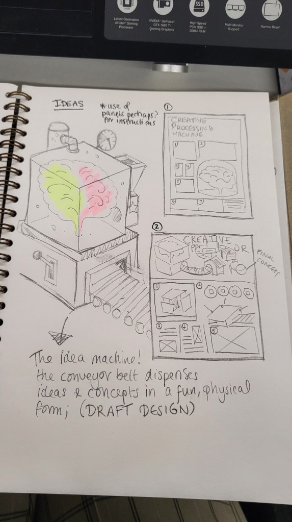
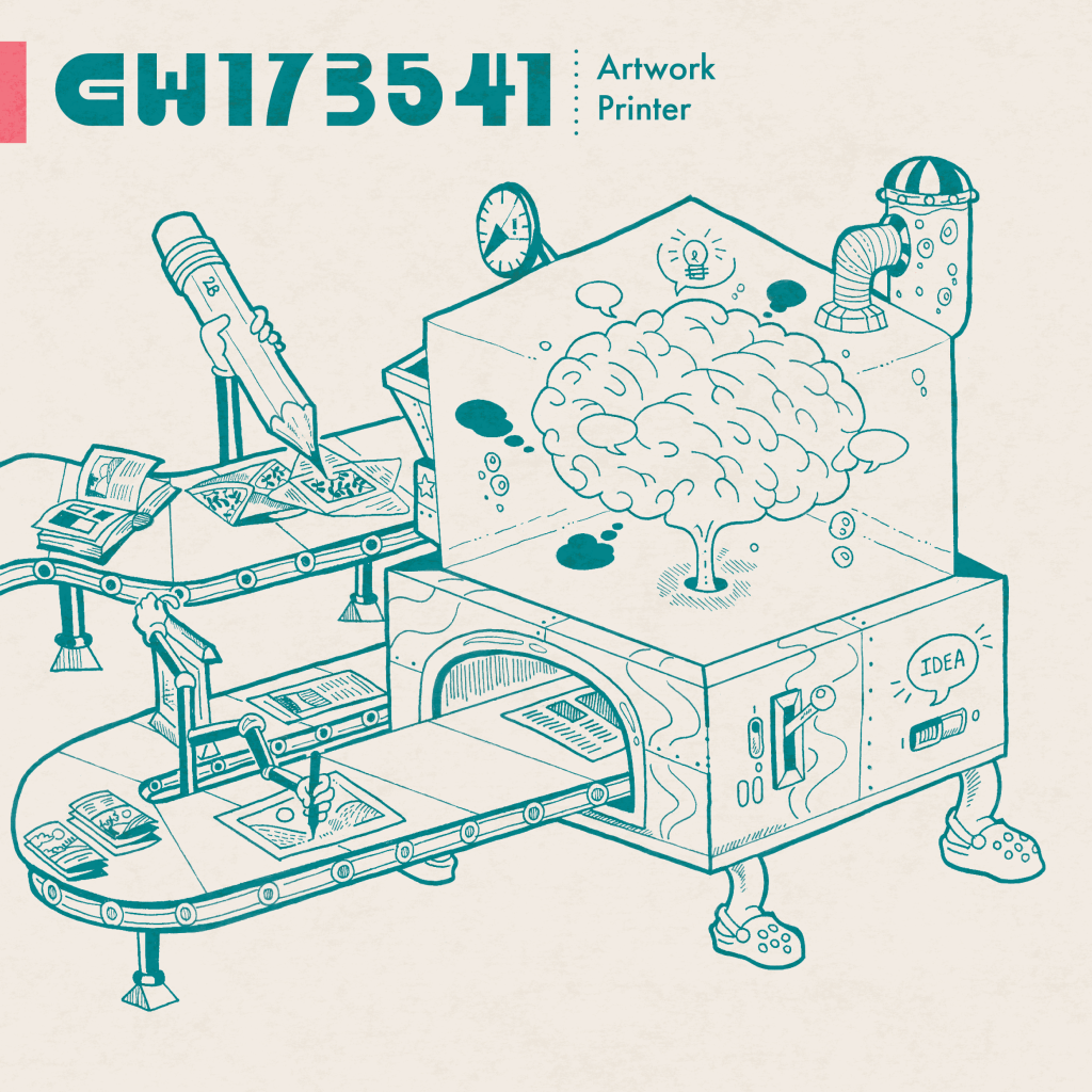
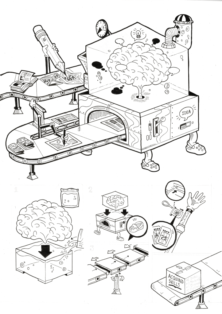
I liked the idea of working on a brain or using a brain as the main processor and system for your creativity. I was inspired by the lectures of week 5, where we explore towards the end about Fire & Wire by Alfred Anwander. The video can be watched here and below.
It was a very interesting 3D remodelling of a brain scan, and seeing how it works fascinated me. Combined with the colours, it made me more interested in what I wanted to do, so I began drafting this concept of a brain processor, which I then took to tutorials with me to get feedback from Paul and my peers.
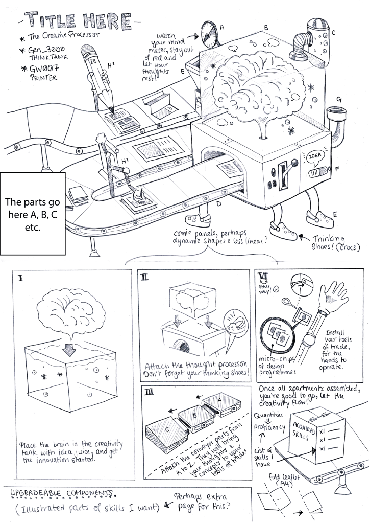
I made the sketch with a 2B pencil, as I do with almost every sketch and by-hand projects I have. I find it satisfying to use a denser and thicker lead, though the risks are great, its not so bad to work with mistakes than try to erase them. I found myself making better work when I worked with mistakes more so than trying to create something intentional!
One of the feedbacks I had that stuck with me, is that I was told the sketch itself is fine the way it is. The style and how its created can be the work alone, and perhaps just using a type-friendly font for the instructions. Though one of the feedbacks was to consider perhaps having no type whatsoever and try to convey the instructions visually – I really like this idea, but I found it was hard to do this without being able to express what the components mean. I think if I ruminated and worked with this idea a bit more, something would have popped up for me.
I also wanted to express how I want to bridge the gaps of my skills acquired and the ones I’ve yet to master. I thought about creating physical components that could symbolise these, such as a printer that prints phone apps for example to symbolise UI/UX design for mobile apps. I first did a brainstorm of my strengths and weaknesses to find icons I can illustrate and symbolise these different aspects.
I followed it up by creating some sketches of my final piece artwork and assets. I’ve always wanted to create my own typeface or some sort of titular font at least as unfortunately these projects have tighter deadlines, so I drew out a style of typeface I like with a ruler and imported this unto Adobe illustrator to turn into a vector.
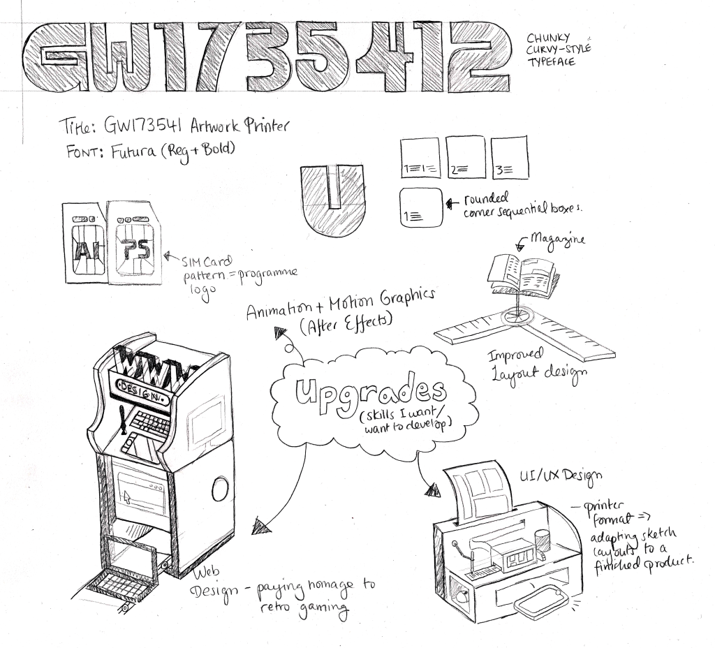
Using the colour palette I was inspired by at the Dopple Press website, I went on to create my Final Piece Artwork for the ‘Process’ brief.
I call this the GW173541 Artwork Printer, part of the Graphic Design Series, this printer can craft all your creative needs and ideas and bring them to life!
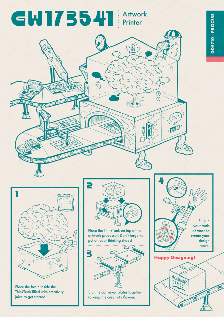
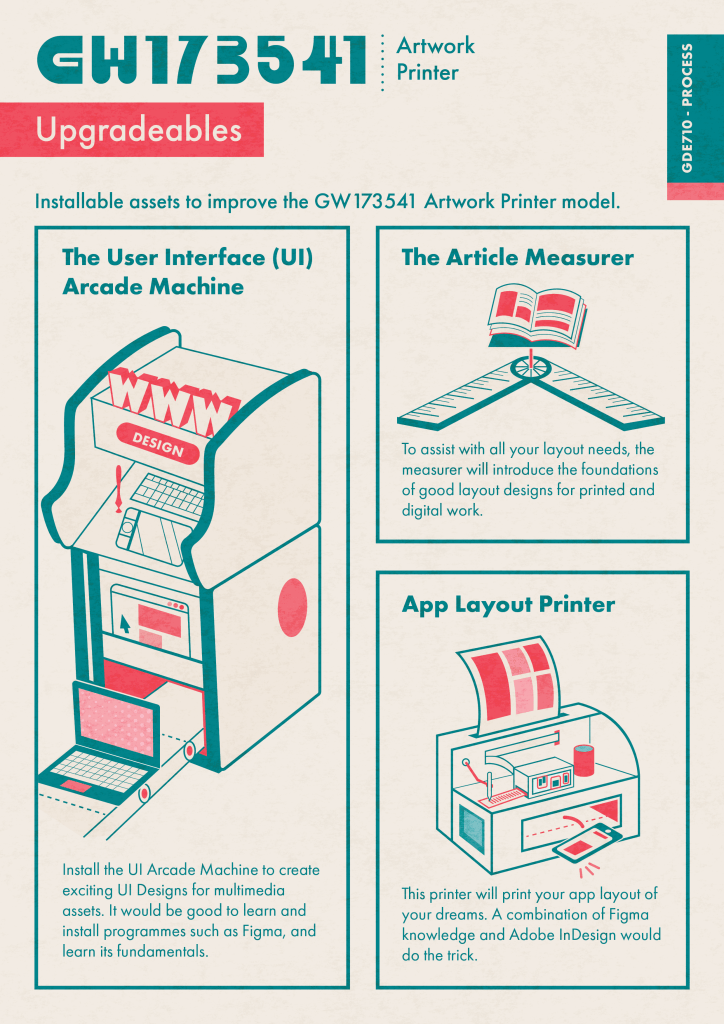
I really like this idea of a convenient manual sheet, that you can take home, its double-sided and wouldn’t take too much pocket space. It’s a convenient piece of information, and I’ve always valued conveniency in the best way possible, so I wanted to show that with formatting the manual to a double-sided A4 foldable flier.

Leave a comment