Project 1
Webinar Notes
I took notes of what the artists and design studios had imparted as advice on self-initiated projects, and kept them in a list manner below as I had on my initial notebook. This way, these notes had influenced the way I approach my project and the direction of research I wanted to explore and consider:
- Third mind – the combination of two minds connect ideas, it is an unseen collaboration and a form of crafting ideas;
- Perspective – seeing another perspective and embrace different forms of medium and feedback;
- Visual research – collect various forms of typography, layout and shapes;
- Originality – It is hard to recreate things the same way but you can always create something amazing out of mistakes;
- Inspiration – Ideas can be formed from many things, for example the artists and studios found inspiration from client-based projects, commercial briefs and sketching on pencil or computer freely. Self-initiated projects open possibilities and freedom due to its lack of a brief;
- Experiment – Play with your tools of trade (this is something I want to explore further
down the line).
I considered my demographic and audience for my project, and ideally I want to target ages from 18 to 40+, as well as families. I would like my speculative food box to appeal to people who want to have an easier and manageable dinner experience that would help alleviate the busy-ness of life while also appeasing their curiosity for a different food experience.
Initially, I considered joining a Filipino food culture Facebook page, recognising its significance in connecting overseas Filipinos with their loved ones at home. However, I decided to focus on recipes passed down from my grandmother to my mother, as well as incorporating reputable Filipino recipes from books and online sources. Panlasang Pinoy as one of the sources I mainly use, as they also sample versions of different dishes influenced by each region in the Philippines.
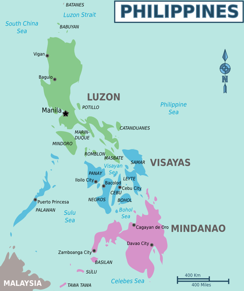
The Philippines is compromised of three different regions to categorise the archipelago, with Luzon, containing the capital city of Manila, Visayas and Mindanao.

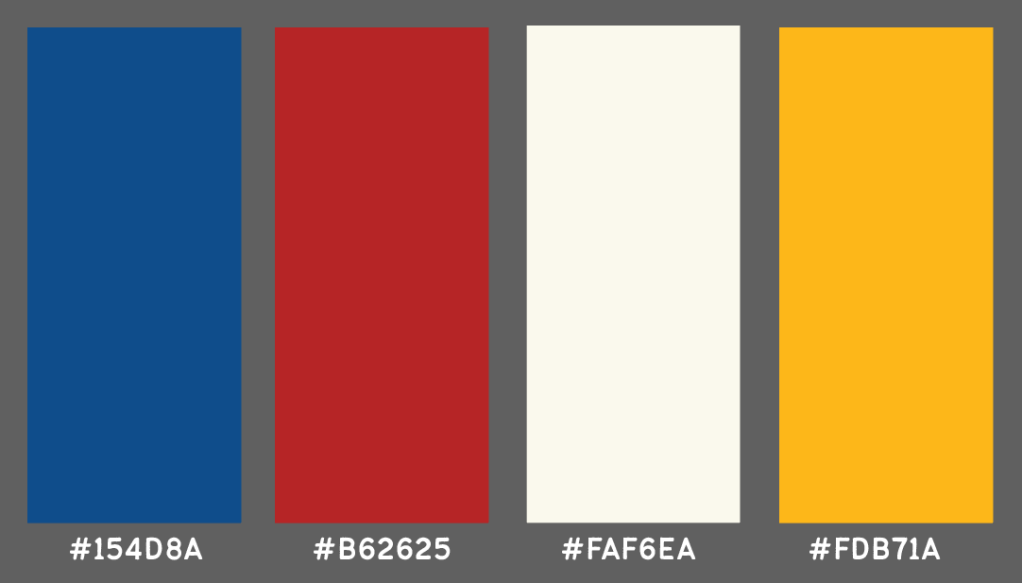
The Philippine colours are very iconic and integral in our cultural identity, so I want to create a specific palette for my food box project.
Design Studio Research: Musang Seattle
I began to conceptualise my logo and branding for my food box by exploring existing Philippine brand identity. I discovered Musang, a Filipino restaurant in Seattle, Washington, USA. Ulysses Design Co drew inspiration from 1920s Filipino culture, using vintage stamps and hotel coasters. They created a hand-drawn brand identity to make Musang personable and authentic.

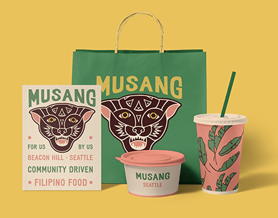
Musang means ‘wild cat’ in Tagalog, and their use of warm colours and retro imagery reinforces the restaurant’s mission to “bring folks together in the spirit of community with Filipino food inspired by fond childhood memories.” Their iconography and graphic elements inspired me to focus my research on familiarity from my childhood, while appealing to both Filipinos and those interested in visiting the Philippines.
Visual Research: Philippine Signage
Pylon signages in the Philippines, especially the capital city of Manila, are familiar everyday signage you can see in all urban areas in the Philippines. They are everywhere, and no matter where you go, you are never lost or these signs tend to act as a waymark of your location or a specific location. Because of their excellent visibility from a distance, pylon signages are a popular way of business advertising.

They are integral in everyday life, and can range from highway signs to free standing signage. I want to incorporate this into my work, but as it is quite broad I’ve considered ways to narrow it further. Because of this, it led me to Jeepney signage.
Jeepney

A national symbol for the Philippines, jeepneys are considered as a cultural icon as well as a unique form of public transport. The jeepney has been an inexpensive mode of transport used for decades to transport multiple passengers from point A to B. It could be considered as a shared taxi with an open back for easy access for passengers to get on and off even in the middle of traffic.
“Everywhere you go in the Philippines—whether in the remote areas or the city—you’re bound to find a jeepney.” – Tatler Asia 2024
Jeepneys originated from the repurposed US army jeeps left behind in the Philippines after World War II. Due to the creativity of each owner, jeepneys across the Philippines have diverse and visually arresting designs. From LED lights, to massive speakers and pop cultural figures , anything is painted on the sides of jeepneys to create personalities that reflect their owners. I also found that, whenever I went home to the motherland, I would always find myself home as Jeepneys are almost everywhere, even rural places.
Akin to coaches and buses, Jeepneys have specific stop points and they feature location names to explain the areas they cover. Sometimes, they can be quotes or statements, but nonetheless, they are featured on jeepneys and follow similar styles in typography.
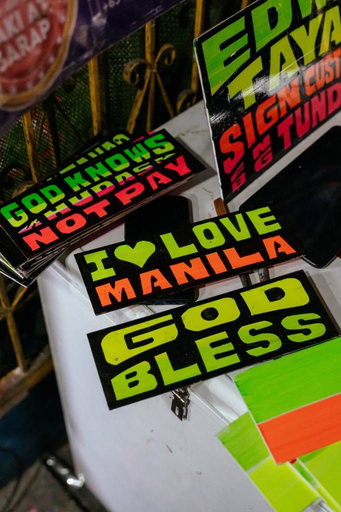
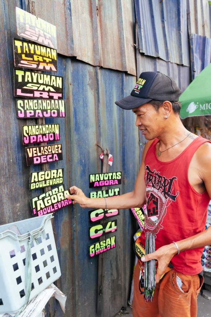
The above images are from GRID Magazine’s coverage of jeepney signmaker, Edwin Tayao.
He is one of the few remaining artists whom crafts these colourful signs by hand.
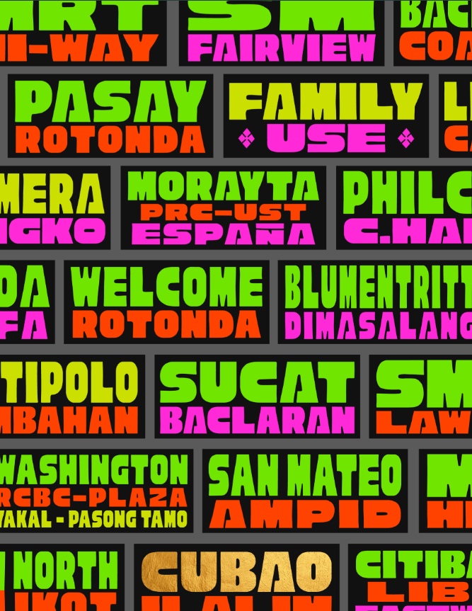
Jeepney typography is bold and colourful, and its even more apparent in the style examples above that makes use of type size and vibrant colours. In a busy road, where you only have seconds to flag down a jeepney, eligible and vibrant lettering is the most effective way to catch a person’s attention. I want to make use of this in my logo development, with the boldness and impact of a serif style font capturing the essence of Filipino culture but also its loud personality that you can’t help but be drawn to.
Baybayin
Baybayin (pronounced Bai-ba-yin) is an ancient, indigenous writing system that was prevalent in the Philippines that went into decline and eventual extinction under Spanish colonisation. It had emerged around the 16th century, primarily used by ethnic groups throughout the archipelago. The writing system was influenced by Javanese and Hindu sources, it is consisting of 17 basic characters representing consonants and vowels – it may be that it was also used to reflect the social and cultural dynamics of the time than just a means of communication.
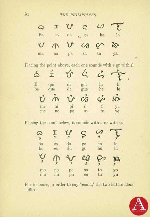
The name itself comes from the Tagalog word ‘baybay’ (pronounced bye-bye) which translates “to spell”. Despite its eventual defunct as a writing system, there has been a revival in Baybayin, in particular with its usage in graphic design and art. An aspect of its revival has been popular among designers to use the scripture as a visual choice to express Filipino identity.
Typographic Research: Baybayan – 50th anniversary of the cultural center of the philippines (CCP)
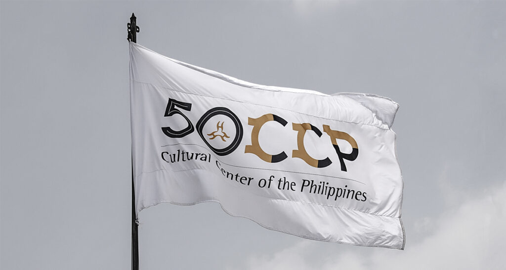

An example of Baybayin used in graphic design is the use of the scripture in TBWA-SMP’s rebranding for the 50th Anniversary of the Cultural Center of the Philippines (CCP). They integrate the scripture in the letters in a clever way, with a mission to get young people interested in Baybayin.
“So by revisiting Baybayin, we not only restore a writing system that we might have forgotten, but we actually restore a large part of our identity.”
Chris Millado, Artistic Director of Cultural Center of the Philippines
Research Task: Moodboard
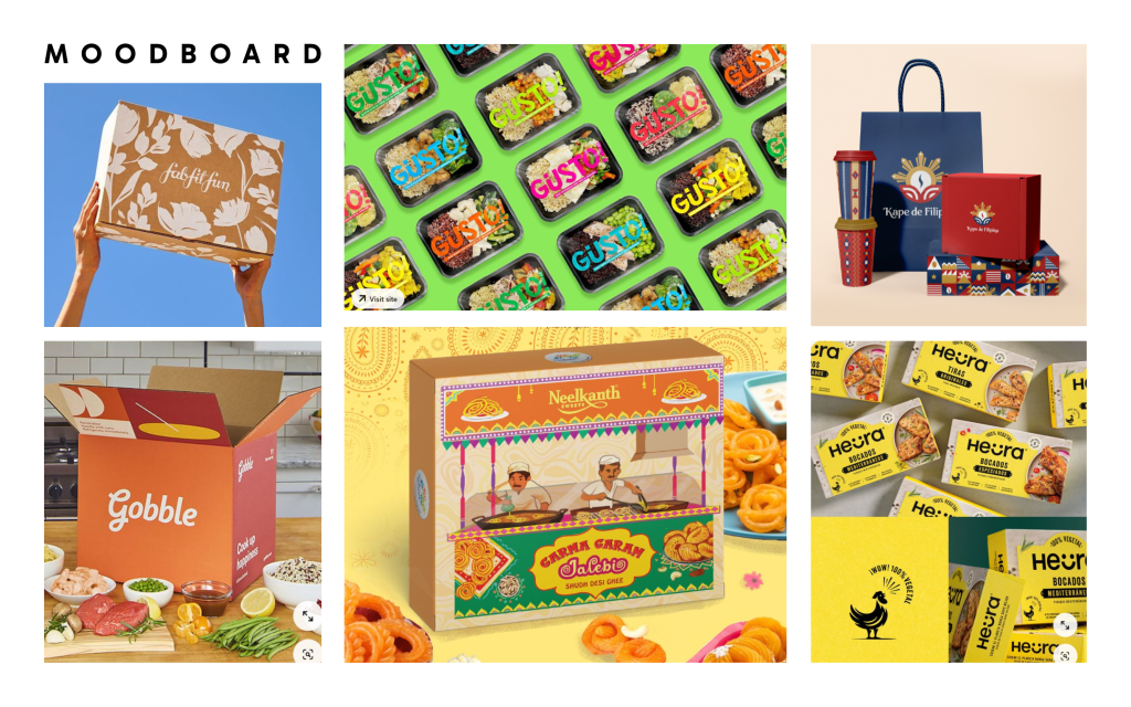
For my research task, I compiled visual research on food and general packaging that I liked, and included it on my Pinterest board for GDE740. I find Pinterest efficient for gathering inspiration in one place, and the designs I chose effectively represent their brands. For instance, Heura Chicken uses a cohesive black and yellow colour scheme with a chicken mascot, while Gusto!’s dynamic, eye-catching typography and alternate colours highlight different dishes.

Leave a comment