Project 1
Webinar Notes
On this week’s webinar, I focused on recording quotes from artists and designers who resonated with me. For example, I found Christoph Miller of Offshore to be a thoughtful designer. He and Isabel Seiffert have a unique, collaborative studio process, covering each other’s bases with their individual skill sets. Some notes I took include:
- Time – Many artists mentioned the difficulty of making time for self-initiated projects, which I found relatable, as these projects are personal and highlight the duality of service provider vs author.
- Dedication – Artists also noted that when they find time for self-initiated projects, they blitz through them before starting client-based projects or commercial briefs.
- Passion – One designer mentioned that if a project resonates with you, you will always find time for it. This is integral to this module, as it’s easy to forget to focus on projects you truly enjoy or
want to do.
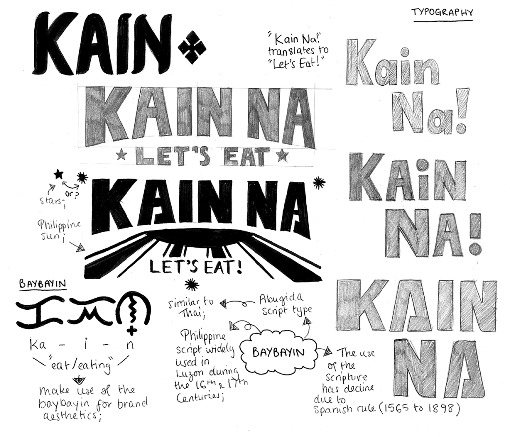
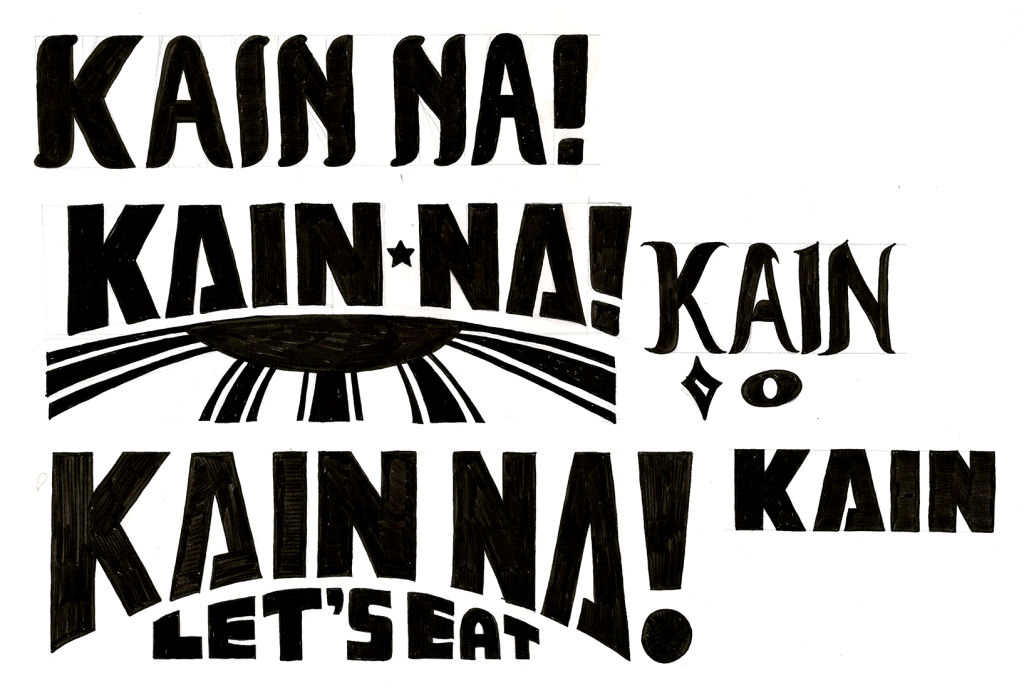
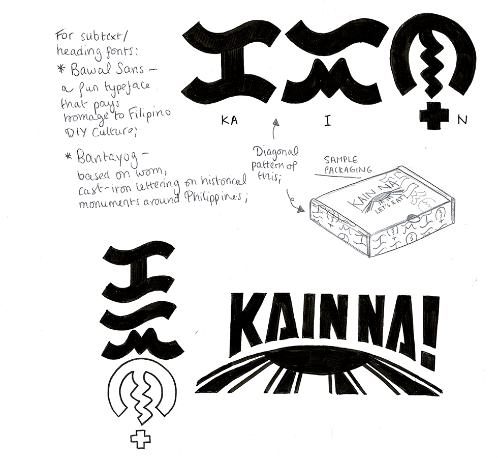
To advance my project, I began sketching ideas for a potential logo. It was important to me to include the Filipino food experience and its cultural significance. In an average Filipino household, we have a phrase to announce when the family should gather to enjoy a meal together: “Kain Na!” (pronounced as KAH – EEN – NAH) This universal phrase means “Let’s Eat!” in Tagalog and extends to the entirety of the Philippines. Although the direct translation is Eat (Kain) Now (Na), it simply announces that it is time to eat, without specifying a particular time of day. Therefore, it is commonly used when food is ready and on the table.
Sometimes when you visit or go to a Filipino house, the phrase “Kain Na!” is commonly heard down the halls, coupled with warm light from the kitchen and laughter from the Filipino folk. This is what I grew up with both back at home in Philippines, and the other Filipino family friends I got to know in my 21 years living in the UK.
Inspiration: HelloFresh Branding and Kamayan
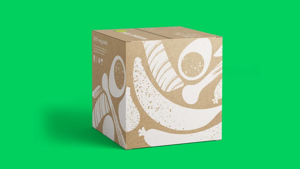
I wanted my food box to stand out and feel authentic by incorporating personal, hand-drawn elements symbolising Filipinos’ ability to improvise and adapt. To this end, I explored popular subscription boxes like HelloFresh, which was rebranded by DesignStudio. Their redesign kept qualities of the old logo, simplifying it for flexibility in print and digital formats. I was particularly drawn to their use of cooking utensils in the branding, giving it a homemade feel that is integrated into their packaging and illustrations.
Kamayan
Inspired by this, I considered the main utensils used in the Philippines, where traditionally, we eat with our hands in a style called ‘Kamayan’.
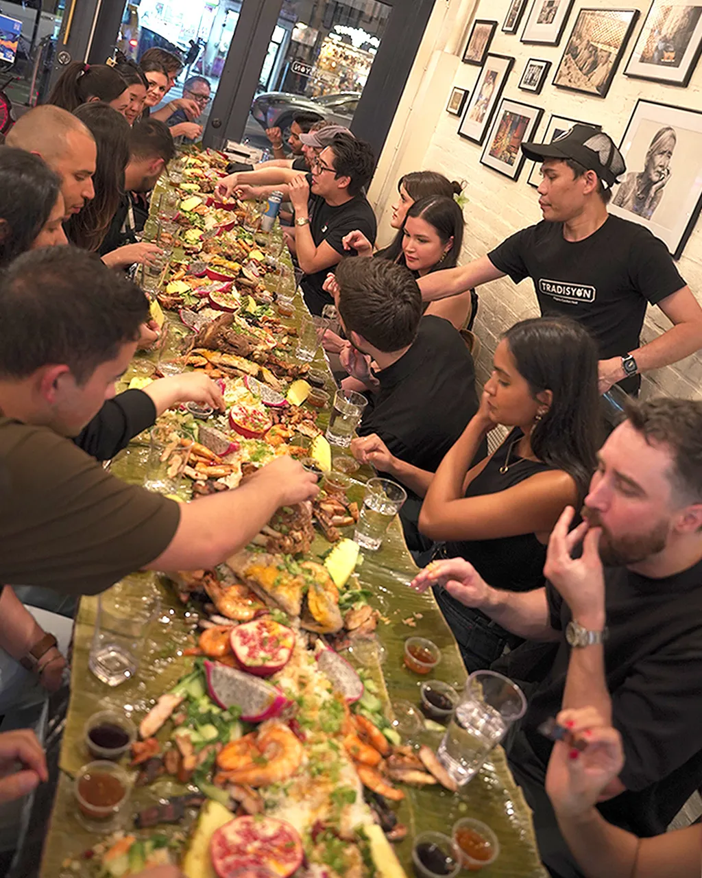
This has seen a revival in recent years and is popular with Filipino chefs and restaurants for its unifying experience. A popular Manhattan restaurant, Tradisyon, offers a kamayan experience for 20-person dinner packages.
The BBC makes an amazing coverage on this restaurant on their World’s Table column.
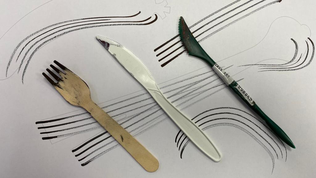
For my project, I used a wooden fork from a fish and chips takeaway to create textures, adding a bit of British culture. I painted with red gouache, using my fingers to smudge parts and create spontaneous textures. I also leveraged the gouache’s flexible, opaque quality to let some of the watercolour paper’s texture show through.
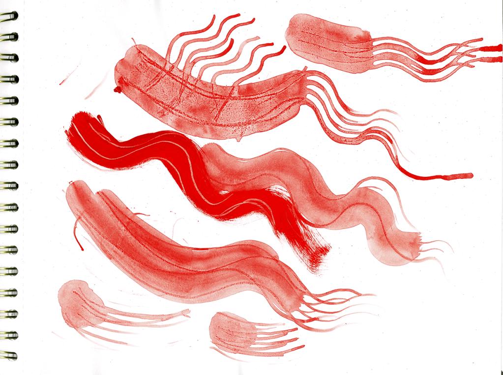
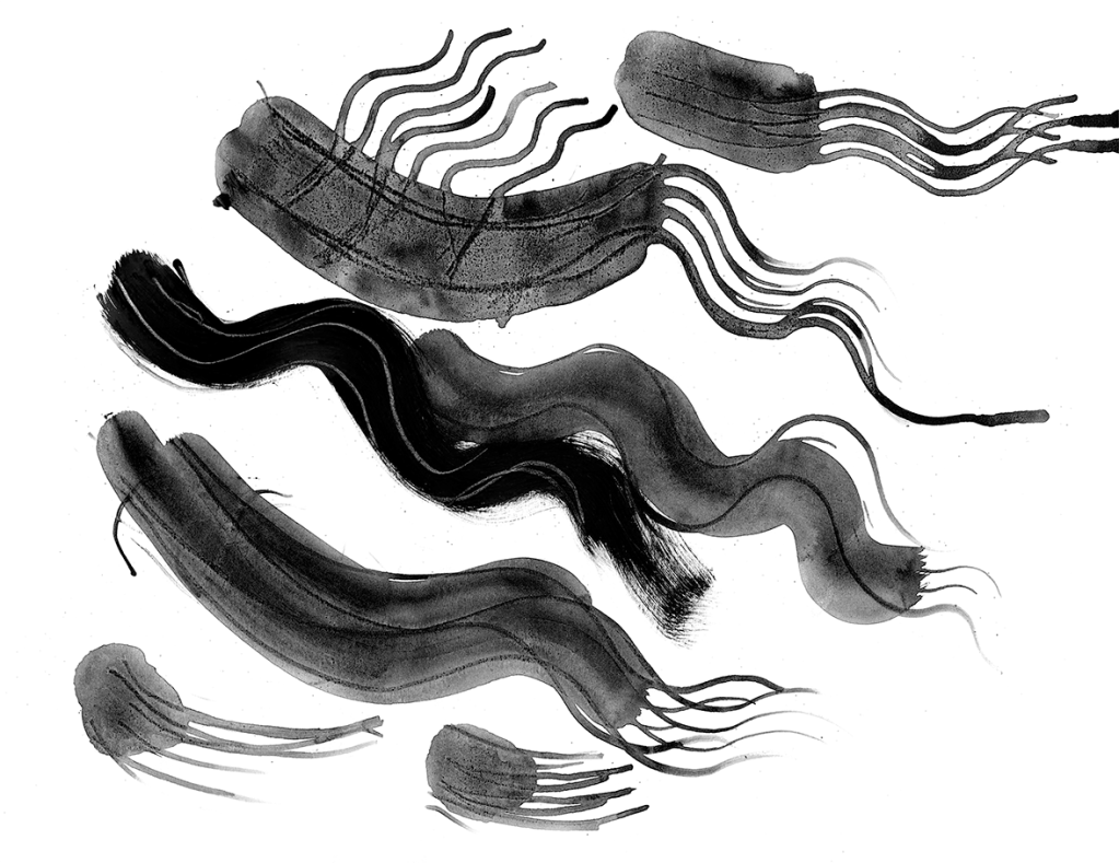
Additionally, I created splatters by flicking leftover paint, mimicking the way we season food by hand and eye estimation, akin to spices being thrown into a pot.
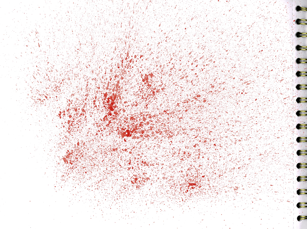

I hope to use these textures in the development of my food box branding, and create something personable that would appeal to my target audience.
Research Task: Solo Practitioners
Eric Kass of Bespoke Brands
Eric Kass is a one-man design studio under Funnel: Bespoke Brands, and he has over twenty years of graphic design, branding and packaging experience. I love his work, and how fun and vibrant it is but also his collaborative style of approach to case studies. He has created his own design process to solve creative briefs (shown below), which I think is very unique and systematic.
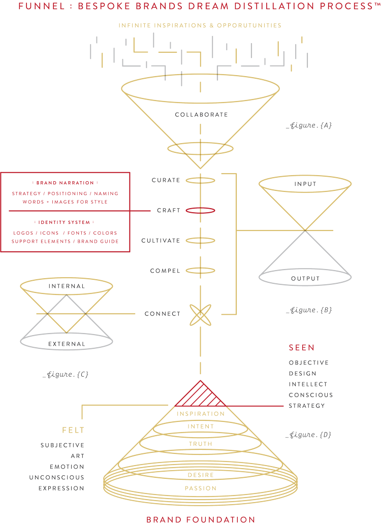
It is very different from how I approach things, as I don’t think I’ve figured out a design process for me exactly, as I tend to come to conclusion spontaneously.
I particularly want to highlight Eric’s work on Misha’s Kind foods for their non-dairy cheese product. He has effectively made use of vibrant colours without it being so garish, and combining both serif and sans serif font tastefully to emulate a farmer-style of branding.
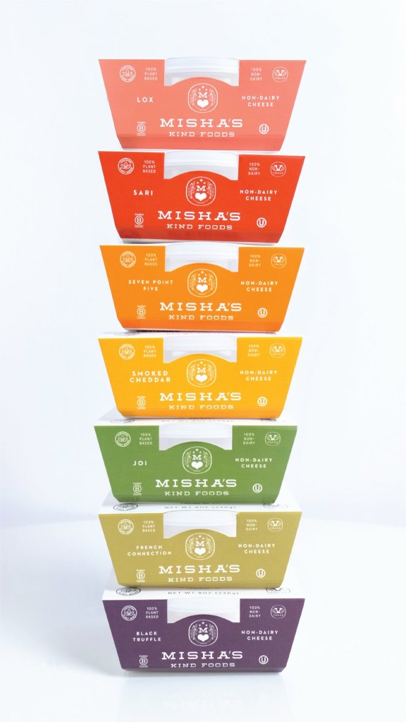
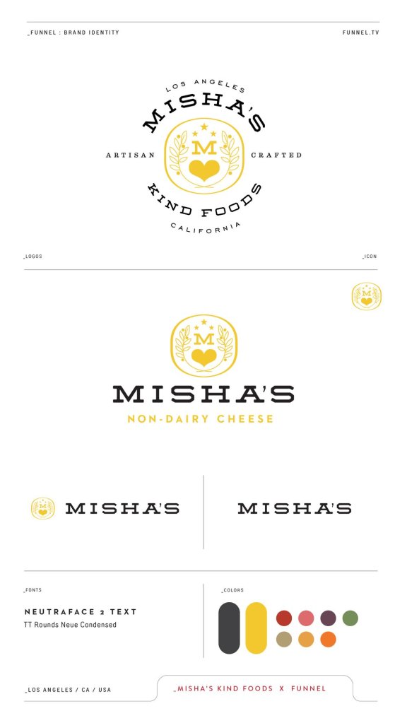
I think the only weakness to this branding is that the Misha’s logo can easily be lost when amongst a shelf. Though it may stand out to people specifically looking for non-dairy options and appealing packages, I find that it may be overshadowed on a shelf with bolder and bigger logos.
Enrike Puerto: Loosey-Goosey
Enrike Puerto’s approach for Loosey-Goosey, a baking powder brand, is a bold branding style that utilises 3D and the effect baking powder has in cooking. It is clearly inspired by the expansive qualities of the product, and its bold colours and imagery definitely highlights itself as a competitor in a smaller industry.
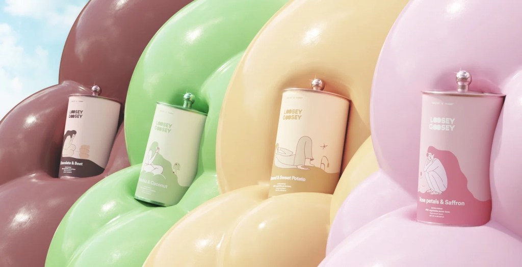
The brand targets the market by addressing the challenges of maintaining good mental health in today’s world. Consequently, it aims to connect with the new generation of home cooks by advocating for healthy, naturally flavoured meals. What I love is the character illustrations in each flavour, just munching away and enjoying the food. I think these fun characters, combined with their attention paid to make emotionally engaging design is what they have done very successfully for a baking powder product.

If there is any weakness to the design, is that perhaps it is not initially obvious it is baking powder at first. So if there is anything to change, I think the designer could have enlarged the baking powder text or highlight it in a different colour somehow. However, I don’t think this is a bad thing as the design itself will have people curious and looking it over, which is what you want a product to do to stand out.

Leave a comment