Project 1
Webinar Notes
I really found this week’s webinar very interesting, as studios and practitioners address the importance of self-initiated projects and how it has influenced the identity and process of a studio. One of the designers mention how self-initiated projects are akin to an ideas paradise while also acting as filter for what works and what doesn’t.
- Self-initiated projects can help you get noticed by potential clients;
- Self-initiated projects can also establish a studio culture and kickstart a company. It also helps designers and collectives understand what they truly care about and things they’re passionate about;
- Self initiated projects vs. client commissions is a reflection of service provider and author, as a designer you have the platform to decide the outcome but it also comes with pressure to create a compelling output;
- Christoph Miller mentions the importance of aesthetics, as they reflect a designer’s personality in some ways. It’s akin to how self-initiated projects are prevalent in how intimate and personal they are in comparison to a client-based project.
Branding Page
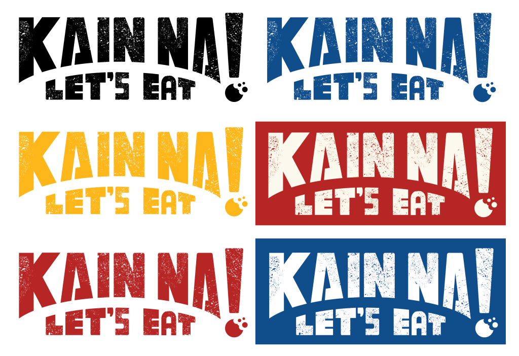
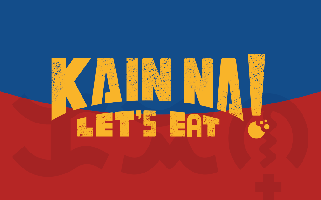
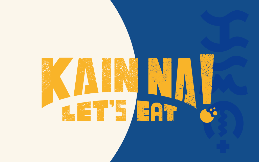
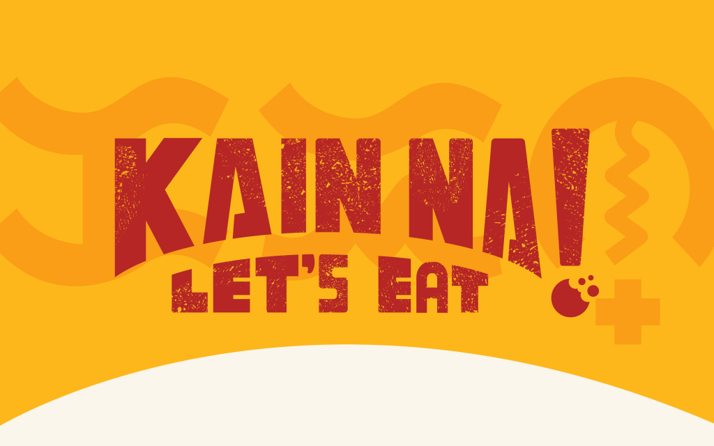
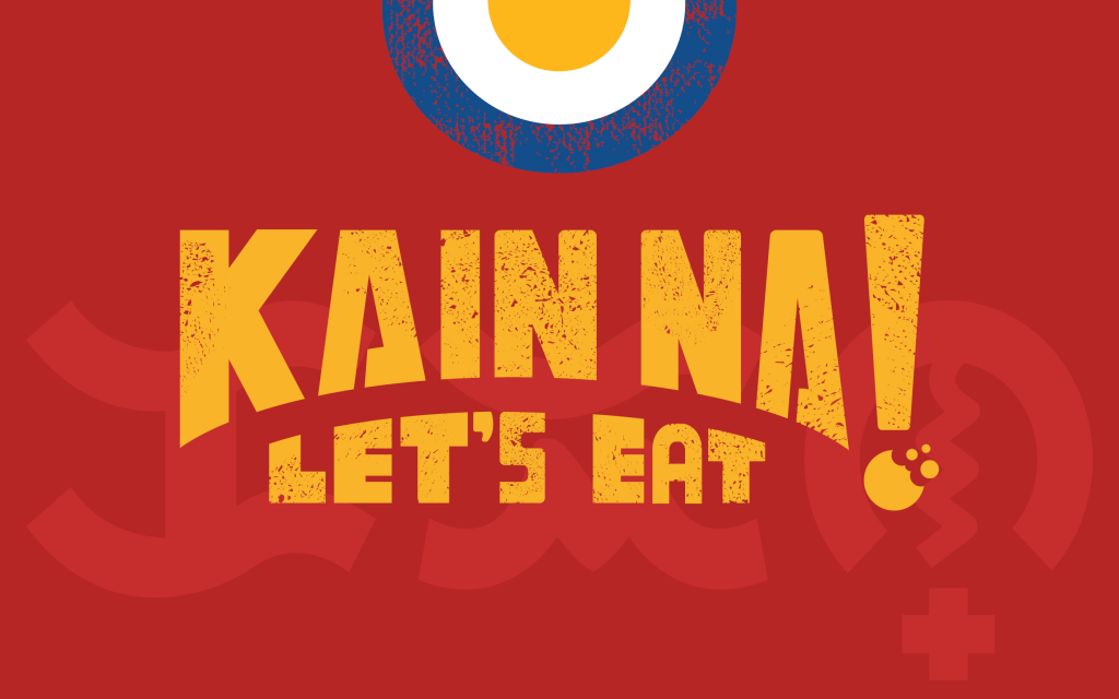
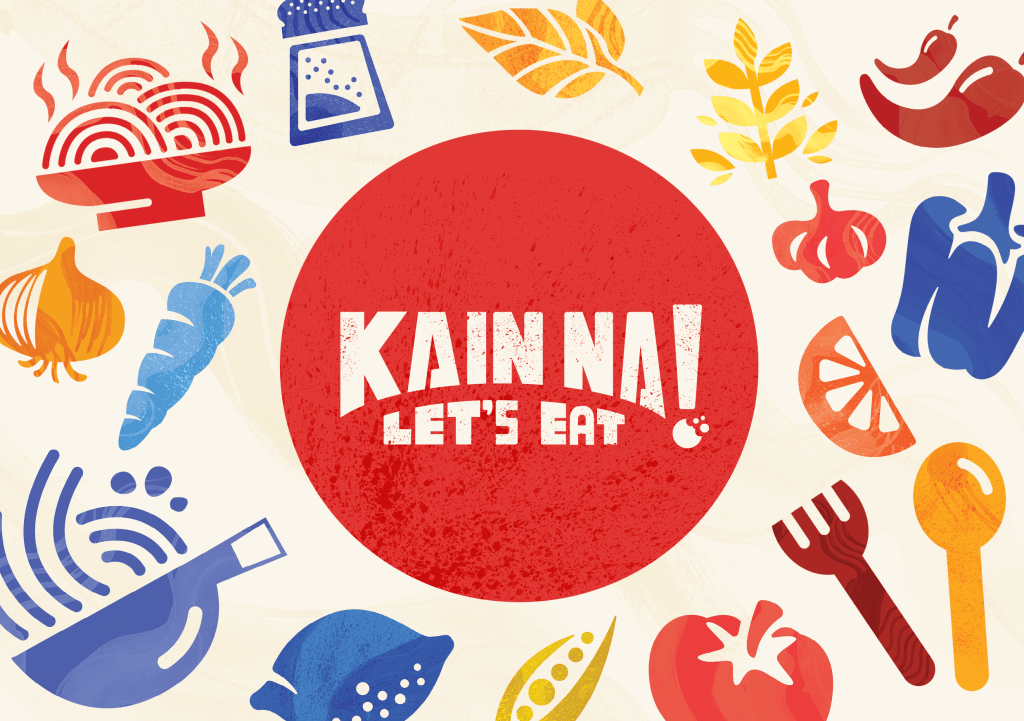
To create my outcome, I vectorised my logo and applied the splatter texture to give it an authentic, homemade feel. This element of Filipino cuisine makes it so delicious, as the dishes evoke the experience of eating family-cooked meals.
Illustrated Icons
I also created some food illustrations in the style of icons that can be used throughout promotional materials and expand the brand design further.
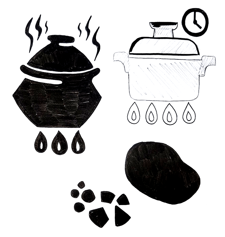
Palayok
A palayok is a traditional Filipino clay pot used for cooking. It’s made from earthenware and is commonly used to prepare a variety of dishes, often over an open flame or charcoal. The porous nature of the clay allows for even heat distribution and imparts a distinct, earthy flavor to the food, enhancing the authenticity of Filipino cuisine.
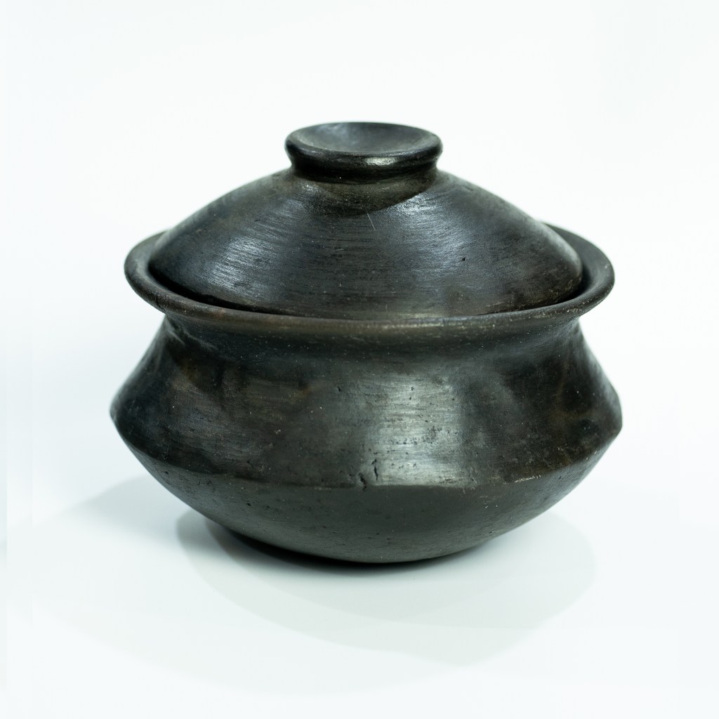
You can access Ancient Cookware’s website over here.
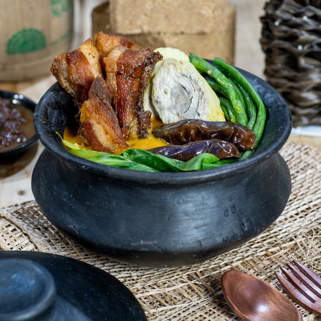
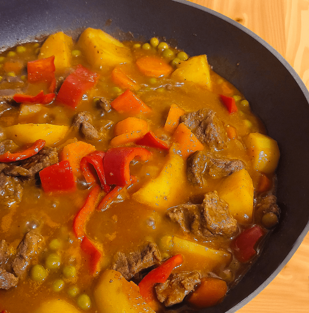
My grandma used to cook Kaldereta, a traditional Filipino stew, in a palayok especially for occasions such as birthdays, celebrations and even when family from overseas come home. I wanted to include this even if its as part of my icon suite for Kain Na!
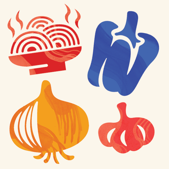
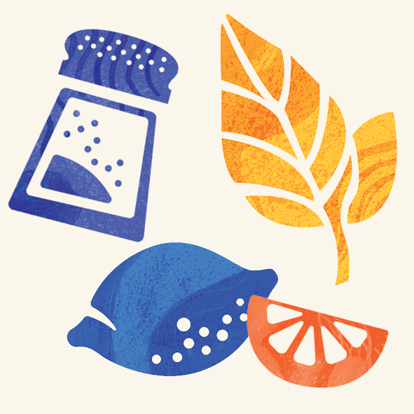
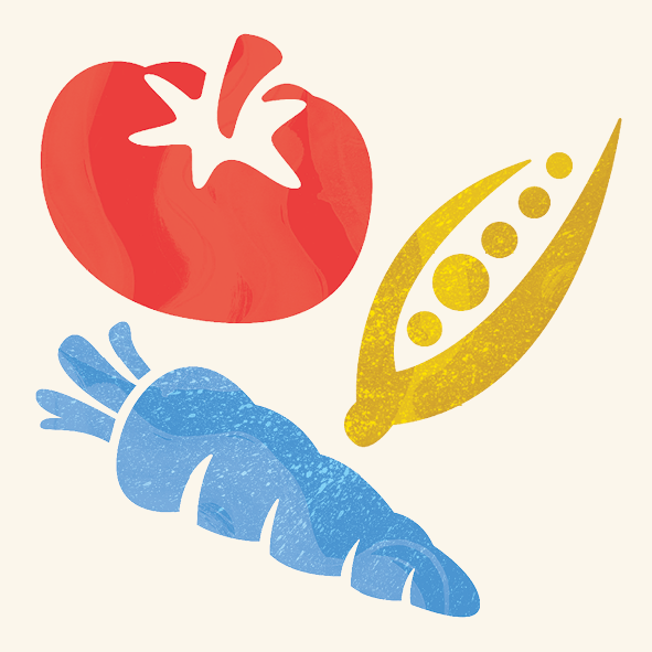
I applied the textures I had created initially with a fork and brush speckles unto the icons and layered them atop the icons in different blending modes. I also coloured the icons from shades of red, blue and yellow to keep with the Philippine palette. However, I kept the images at a lower res for easier upload unto the blog.
Content Fonts: Bantayog and Gabarito
Bantayog
For the branding content and headings, I explored accessible fonts for the food box and discovered Jad Maza’s typeface, ‘Bantayog’.
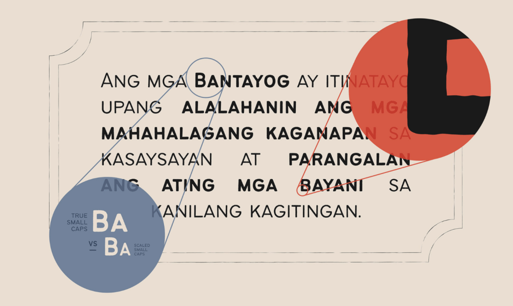
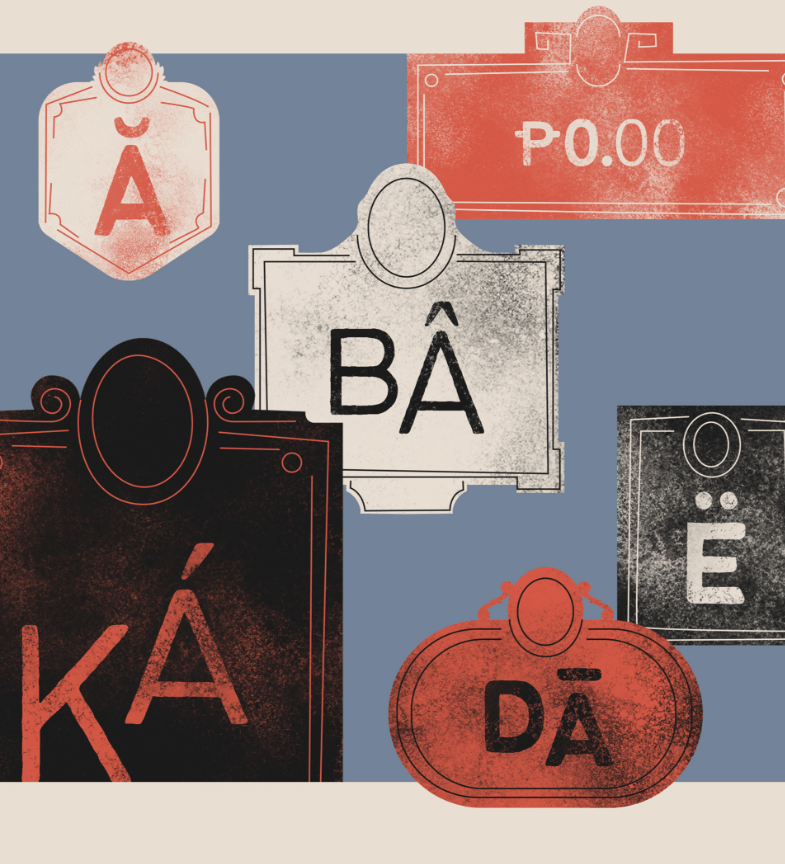
‘Bantayog,’ meaning ‘monument‘ in Filipino, is used for historical markers and monuments celebrating important figures in Philippine history. Thanks to these heroes’ contributions, the Philippines is the warm and lively community it is today. I think this font style would be perfect to use as titular or display text, as well as headings.
Gabarito

Gabarito is a google font that is free to download, and has a light-hearted geometric sans typeface.
‘Named after the Brazilian Portuguese work for an answer sheet, Gabarito was made to help young people learn and overcome the university entry exams known as “vestibular”, and it did that by packing lots of high-school level symbols and figures into a very friendly voice that was equal parts functional and engaging.’ – Google Description
It’s friendly voice and accessibility is what makes Gabarito a perfect font to use for basic text content for the branding, for example, it would be ideal for the cooking instructions on the recipe cards, etc.
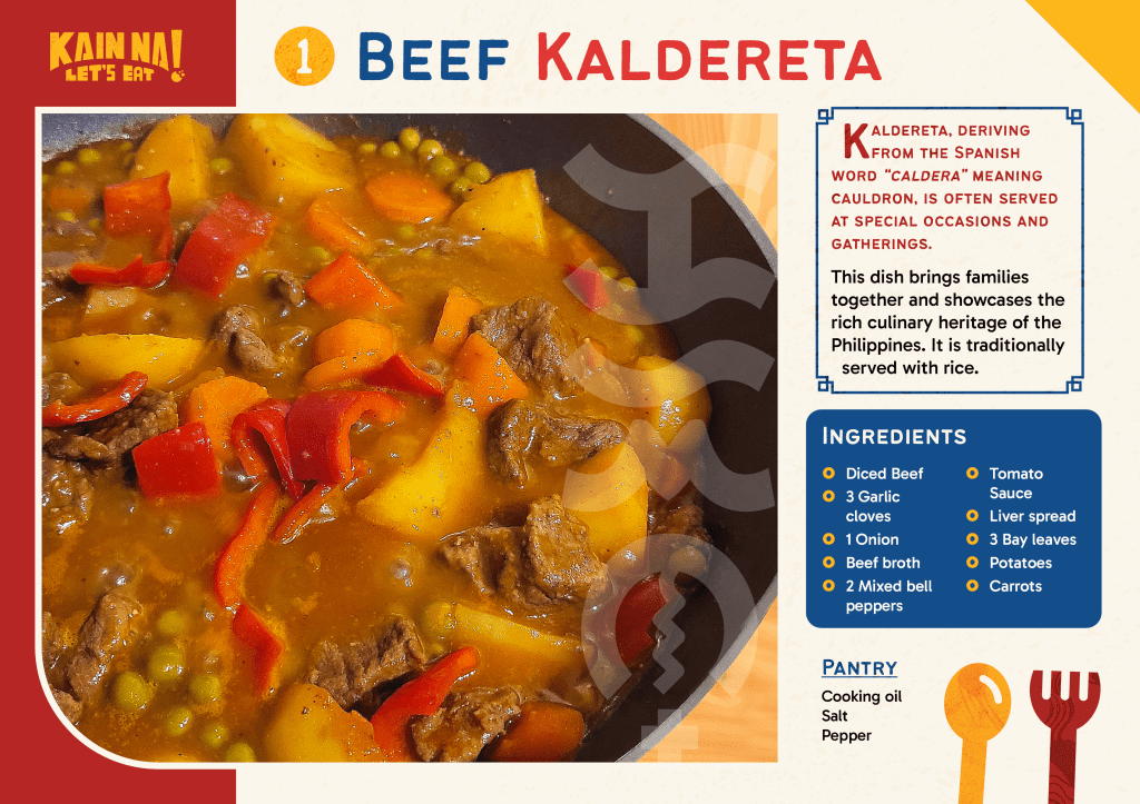
With the fonts selected, I can create the recipe cards! Every food subscription box isn’t the same without them. I think its important to have something that would be easy to follow, as someone who has had a food subscription box for several months, but also appealing as the recipes is the selling point. I found myself choosing HelloFresh as they had a good range of food to choose from, hence I decided to cook a traditional Filipino dish, Kaldereta, to use as a sample for a recipe card design.
Final Piece Designs
I designed the recipe card to stand out by including origin stories or tales associated with every Filipino dish. This design educates people about the dishes they make. Additionally, I added a “Did You Know?” segment by the instructions, highlighting the regional variations in cooking each dish.
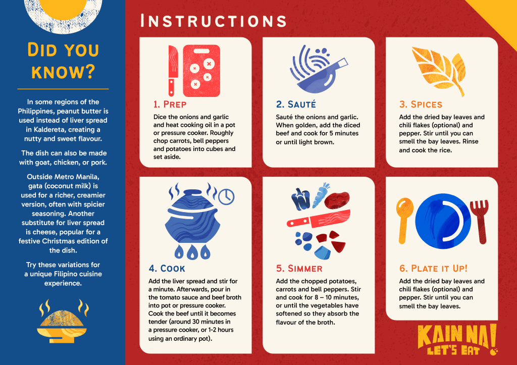
“Did You Know?” segment here, in which it details alternate versions of the dish by the different Philippine regions.
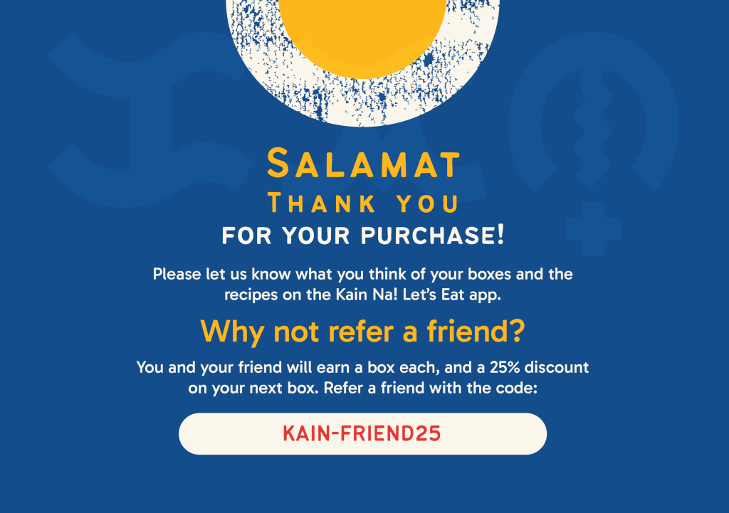
I also wanted to make use of the illustrated food icons more, and I had to consider what I can do with the limited time I had. I’ve decided to create a thank you card design that would come with every box ordered, and including a friend discount to encourage more customers to get into it. I also thought it would be the best time to incorporate more Tagalog words, such as ‘salamat’ for thank you.
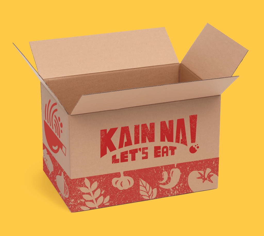
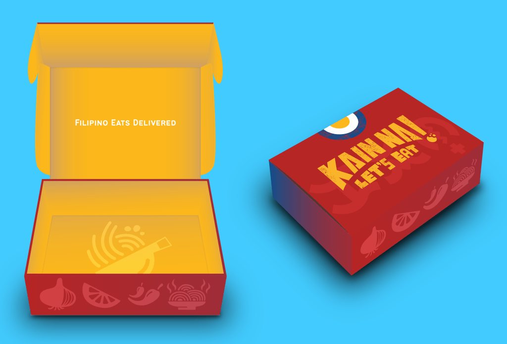
Box Packaging Designs
Last but not least, I wanted to create mock-ups of the packaging design and this is how the boxes would look when people order them. I have mocked up both a large cardboard box for bigger orders that would fit weekly meals, and a smaller box suitable for one-off meals or single meals people can order.
Research Task: Reflection

I’m pleased to have reconnected with my cultural heritage in greater depth compared to my GDE710 module. The integration of the Philippine flag colours and cultural elements, such as the jeepney-style hand-drawn logo I crafted and vectorised in Adobe Illustrator, worked particularly well. Additionally, my research on Baybayin helped me connect with an aspect of my cultural identity I hadn’t explored before.
However, due to time constraints, I couldn’t delve as deeply into this project as I wanted, despite my passion for my Filipino heritage. Having been in the UK for over 20 years, I still speak Tagalog at home and cook Filipino dishes.
I would have liked to create more templates for the recipe cards, featuring different dishes, and perhaps design a limited edition palayok with the Kain Na! branding. I also wanted to develop more packaging designs, such as ingredient bags and stickers, and potentially design a website or app interface for Kain Na! where people can order recipes.
In the future, I may revisit this project and work on bringing Filipino cuisine to households.

Leave a comment